Help:DataVisualizationInCytoscape
From WikiPathways
This tutorial describes how to visualize experimental data on WikiPathways in Cytoscape. After importing pathways using the WikiPathways App, they are mapped to the same identifier system as used by the data. Data are then imported, and a visual style is created to visualize the data on pathways.
Also see the Cytoscape tutorial for pathway visualization.
Contents |
Installation
Cytoscape
- Download Cytoscape here: http://www.cytoscape.org/.
- Launch Cytoscape
Cytoscape Apps
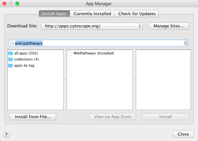
- In Cytoscape, open the App Manager under Apps > App Manager.
- In the search field, type WikiPathways to search for the WikiPathways app. Select the WikiPathways app from the results and click Install.
- When the installation is complete, click Close to exit the App Manager.
Alternatively, Cytoscape apps can be installed directly from the Cytoscape App Store. If Cytoscape is open on your computer, you can click Install on the relevant app page, and the app will install.
Pathway import and mapping
Import pathways from WikiPathways
Based on over-representation analysis, two pathways have been identified as significant for this dataset. To start, we will open these pathways.
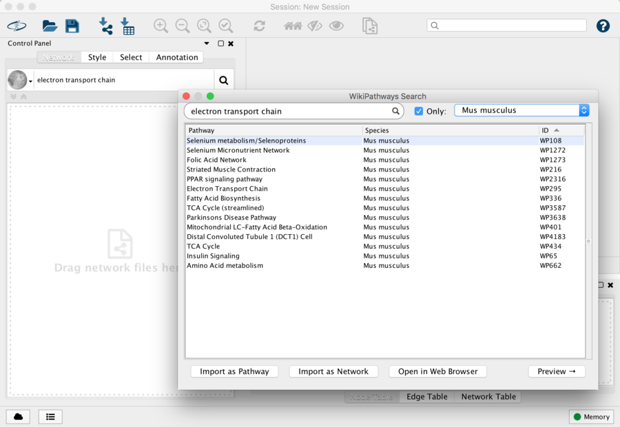
- Locate the search field at the top of the Network Panel and choose WikiPathways from the pulldown options.
- Type in Electron Transport and hit Enter or click the icon to search.
- In the results dialog, check the box for Only and select Mus musculus in the species drop-down.
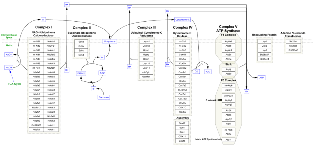
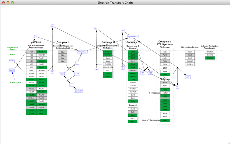
- In the pathway results, select the Electron Transport Chain and either double-click on the entry to open, or click on the Import as Pathway button at the bottom right. Once opened, the pathway should look like this:
Once the pathway opens in Cytoscape, it should look like this:
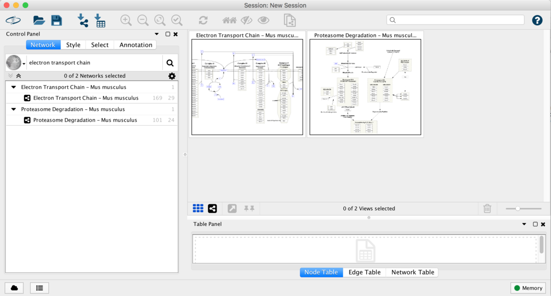
- Repeat the steps above to search for Proteasome and import the Proteasome degradation pathway.
- You should now have both pathways open in Cytoscape:
Identifier Mapping
In the Table Panel you can see that the gene identifiers in these pathways from Ensembl. It turns out that the experimental data we will be using in this example is also annotated with Ensembl identifiers. But this is not always the case! Fortunately, it is very easy to get a new column of identifiers in any of the major types. In this example, we will go ahead and add a column of Entrez Gene IDs to demonstrate this functionality.
- In the Table Panel, right click on the column header XrefId which contains the identifiers for the data nodes.
- Choose map column to bring up the ID Mapping dialog
- Select the following:
- Species: Mouse
- Map from: Ensembl
- To: Entrez
- Then click OK
- Now you have a new column of Entrez Gene IDs (all the way to the right)
Note that the WikiPathways app automatically adds Ensembl identifiers to pathways upon import. This means that manually annotating the pathway is only necessary if the data is annotated with a system other than Ensembl.
Data import
Download data
For this tutorial, we will use an example dataset describing intestinal changes in response to fasting in mice. The data gene expression array data, and is in the form of a text file.
The experimental data for this tutorial can be found here: Starvation_dataset_trans.txt.
Source: Sokolovic et al. BMC Genomics. 2007 Oct 9;8:361
Import data to Cytoscape
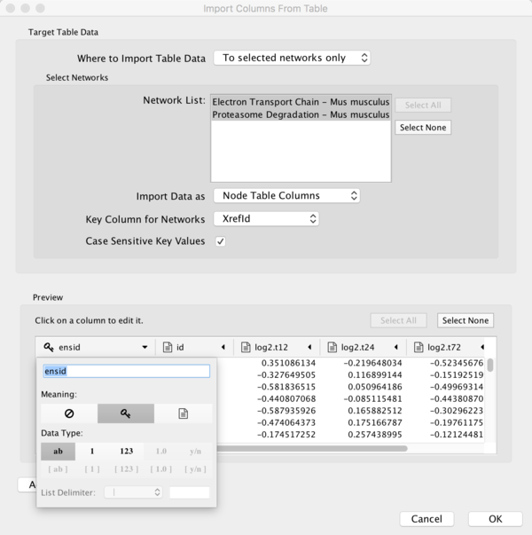
- To import the experimental data, select File > Import > Table from File.... Select the starvation_dataset_trans.txt file and click Open.
- Under Where to Import Table Data, choose To selected networks only.
- To select both pathways, click the Select All button.
- Under Key Column for Networks, select XrefId (the column with Ensembl IDs).
- In the Preview section, click the expand symbol at the top of the ensid column. This will open an interface where you can define the details of the column, such as data type etc.
- For the purposes of this tutorial, click the key symbol. This defines the ensid column as being the key column, which will be used to link the data to the pathways.
- Click OK to import the data.
Data visualization on pathways
The data and pathways are now both imported and linked and we can visualize the data on the pathways. For this tutorial, we will create a color scheme for all significant nodes, based on ANOVA values for a comparison across three experimental groups.
- In the Control Panel on the left side of Cytoscape, select the Style tab.
- In the list of Properties click on the triangle next to Fill Color to expand.
- Click on Fill Color next to Column. In the drop-down, select ANOVA to select the ANOVA column from the data.
- Under MappingType, select Continous Mapping.
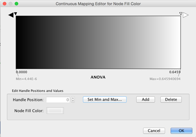
- Double-click on the default color continuum to customize it.
- Set the min/max values by clicking the Set Min and Max... button. Set Min to 0 and Max to 0.05.
- Set the colors for both min and max by double-clicking on the small triangles and choosing a shade of green.
- For the large right-most triangle, set the color to a pale gray color.
You now have a color scheme where nodes with an ANOVA value of 0.05 or below is colored green, and all other measured nodes are colored gray. Nodes that are not found will simply be white.
Export visualizations
Any pathway or network visualization in Cytoscape can be exported into a number of graphical file formats, which can easily be included in publications and websites. File formats supported for export are PNG, JPEG, PDF, PostScript and SVG.
- To export the pathway visualization, select File > Export > Network View as Graphics...
- Select the export file format, and designate a location name filename for the export.
